
Dining Room Paint Colours – Your Guide to Right Shade Selection
The dining room is a central gathering space in many homes, where family and friends come together to share meals and create memories. Choosing the right dining room paint colours can significantly impact the room’s atmosphere, setting the stage for comfort, elegance, or bold expression.
In this Jim’s Painting NZ blog, we’ll help you make the right paint colour choice.Whether you’re planning a full renovation or just a simple refresh, exploring different dining room paint colour ideas can help you find the perfect look for your space.
Understanding the Impact of colour
Colours and colour design have a powerful influence on mood and perception. In a dining room, where social interactions often occur, selecting the right palette can enhance the overall experience. Warm tones like reds and oranges stimulate appetite and conversation, while cooler hues such as blues and greens create a calming effect. Neutral shades provide versatility and allow for flexible decor changes.
Popular Paint colours for Dining Rooms
Here are some popular interior paint colours for dining rooms that can elevate your space:
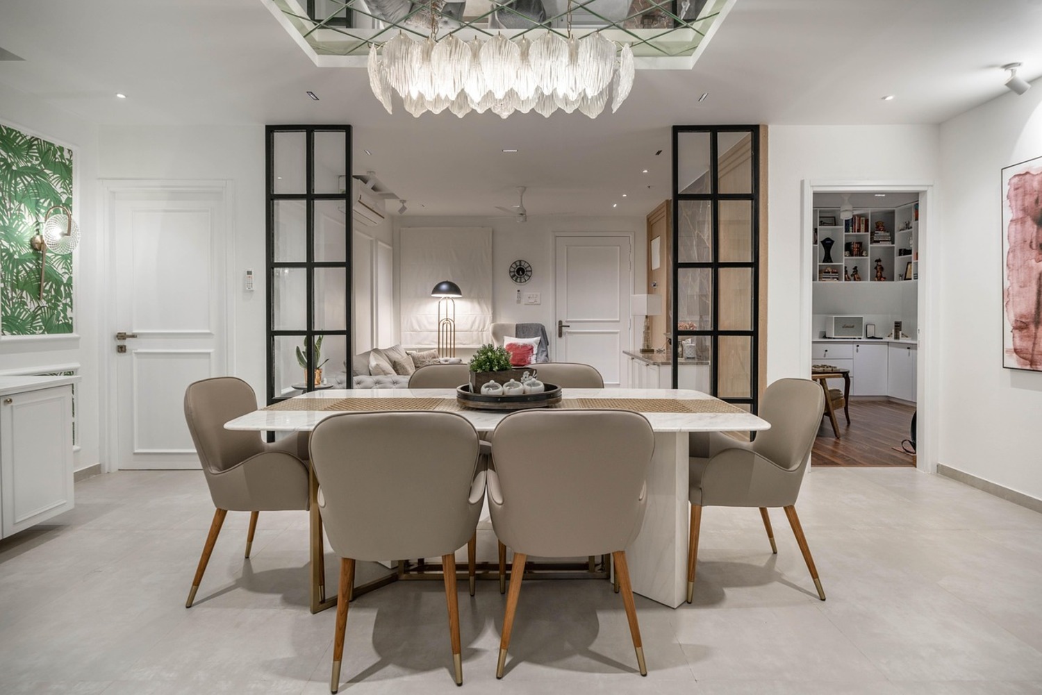
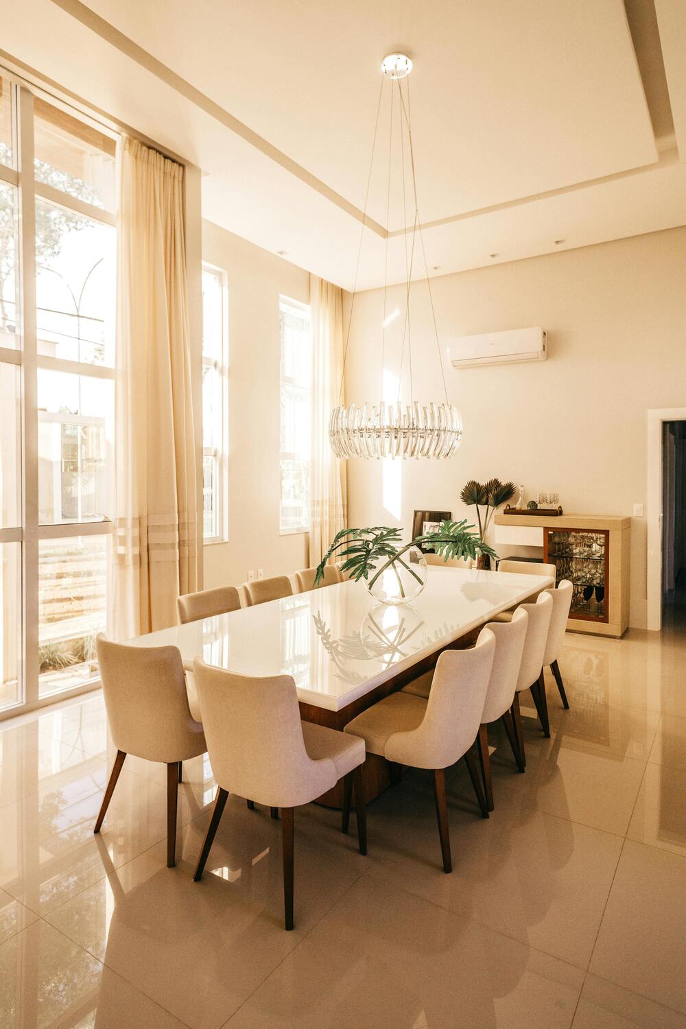
1. Elegant Neutrals
Neutral tones are timeless and adaptable. Shades like beige, taupe, or soft gray provide a sophisticated backdrop that complements various furniture styles. These hues work particularly well in formal dining rooms or spaces with bold accent pieces.
Tip: For added depth, consider using a two-tone design by pairing light walls with a darker wainscoting or trim.
2. Warm and Inviting Reds
Red has long been a traditional choice for dining rooms, evoking warmth and energy. Deeper reds like burgundy or wine tones create an intimate atmosphere, ideal for hosting cozy dinners. Lighter shades such as coral or terracotta can give a more modern twist.
Best for: Traditional or vintage-inspired dining spaces.
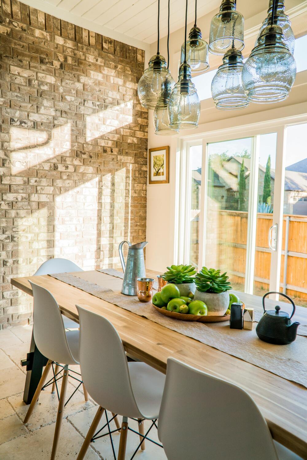
3. Serene Blues and Greens
For a calm and inviting setting, explore shades of blue and green. Soft sage, teal, or powder blue can create a soothing ambiance, while deeper hues like navy or emerald add richness and drama. These colours pair beautifully with wooden furniture and natural decor elements.
Best for: Relaxed dining rooms or spaces with plenty of natural light.
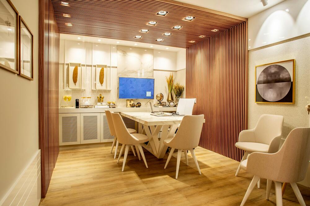
4. Sophisticated Grays
Gray tones continue to dominate interior design due to their versatility. Whether you prefer warm grays with brown undertones or cooler slate tones, gray offers a refined aesthetic that pairs well with metallic accents and contemporary furniture.
Best for: Modern, minimalist, or Scandinavian-inspired dining rooms.
5. Bold Black and Charcoal
For a striking statement, black or charcoal walls create an edgy yet elegant dining experience. These dramatic tones can be softened with lighter furniture, mirrors, and ample lighting to maintain balance.
Best for: Modern, urban, or high-contrast interiors.
Choosing the Right Finish
In addition to choosing paint colours for your dining room, selecting the right finish is essential to achieving the desired effect.
- Matte finishes offer a soft, understated look but may be harder to clean.
- Eggshell finishes strike a balance between matte and glossy, providing durability and a subtle sheen.
- Satin finishes are ideal for dining rooms prone to splashes or stains since they are easier to wipe clean.
Creating Visual Interest with Accent Walls
If you’re hesitant to commit to bold dining room paint colour ideas, consider adding an accent wall. This technique allows you to introduce vibrant hues without overwhelming the entire space. Popular accent wall colours include deep blue, burnt orange, or forest green. Pair these shades with neutral surroundings to maintain balance.
Coordinating with Furniture and Decor
When choosing colours to paint a dining room, consider the existing furnishings and decorative elements. Wooden furniture pairs well with earthy tones like warm browns or deep greens. Metallic accents, such as brass or gold, pop beautifully against jewel-toned walls.
For a more eclectic style, mix contrasting shades by pairing pastel walls with vibrant artwork or colourful dining chairs.
Lighting Considerations
Lighting plays a vital role in how dining room paint colours appear. Natural daylight will highlight cooler tones, while artificial lighting can add warmth to deeper hues. Test paint samples at different times of day to see how the colours change under various lighting conditions.
Creating a Cohesive Flow
For open-concept homes, ensure your chosen paint colour ideas for the dining room harmonize with adjoining spaces. Complementary tones, such as soft greens flowing into neutral beiges, can create a seamless transition throughout the home.
Professional Painting Services
If you’re unsure how to execute your vision or want a flawless finish, consider hiring a professional painter. Experts can recommend the best paint colours for your dining room and ensure precise application for lasting results.
For those seeking professional residential painting services, Jim’s Painting NZ offers expert guidance and quality workmanship to transform your dining room with confidence.
Conclusion
Choosing the perfect dining room paint colours involves balancing aesthetics, mood, and practicality. By exploring various dining room paint colour ideas, you can create a space that reflects your personality and enhances your dining experience. Whether you prefer timeless neutrals, vibrant reds, or soothing blues, the right paint colour can make all the difference.For professional advice and exceptional painting services, trust Jim’s Painting NZ to bring your vision to life. Call us today at 0800 454 654 to get a free painting quote.